HEMA-app

HEMA has one of the most extensive loyalty programs in the Netherlands. Millions of people are enthusiastic point collectors. Together with HEMA and Q42 we developed a new app that combines the loyalty program with e-commerce: a native shop focused on maximum conversion, stability, and speed. With the simplicity that HEMA is known for.

Native shop for real HEMA fans
The app allows you to collect points as well as spend them. To ensure optimal conversion and user experience, we opted for a native app. The use of as many native OS interaction patterns as possible make for an intuitive user experience and seamless, quick transitions, allowing HEMA to offer excellent brand experience and maximum conversion.
Gradual introduction
The app’s loyalty section went live in April 2020. Improvements were implemented mainly under the surface with a focus on stability, speed, and a solid user experience. Features that make everyday use more fun and easier were also added, like a points scoreboard and a sausage loading animation. The shopping functionality was released in 2021. By having the shopping take place within the app, that experience has been made much more user-friendly and appealing.

User-friendly and smooth
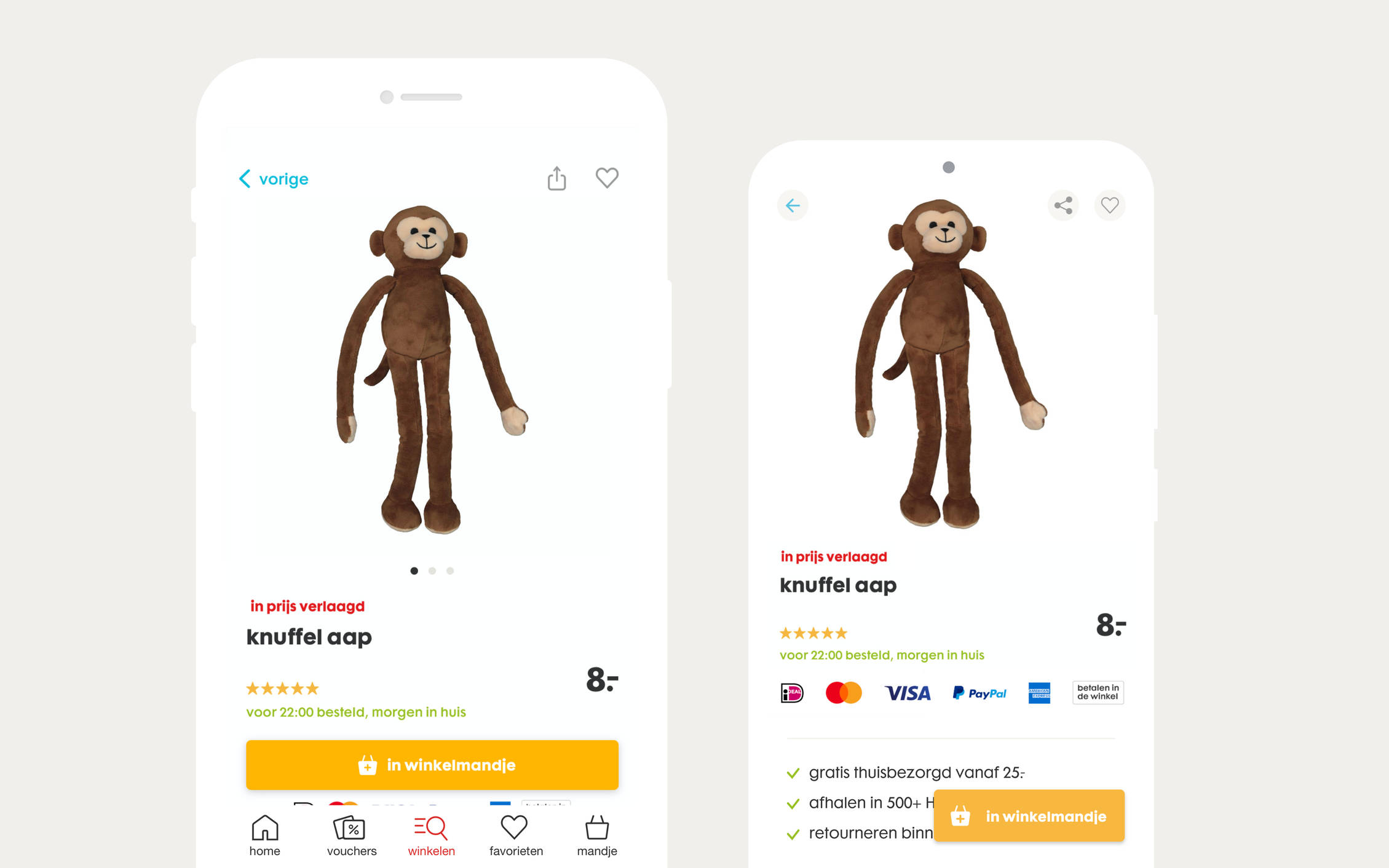
The shopping functionality of the app focuses on user-friendliness with the characteristic HEMA simplicity. We have made sure that long product pages load quickly and smoothly, and that matters such as color and size selection are properly handled. In addition, frequently requested functionalities have been added, such as adding favorites.
Native design a top priority
We use our mobile phones so often that at some point our finger movements become instinctive. The new design takes these habits into account, so that you can use the app without thinking about it. "A basic example is the back button on Android devices," says Floor Brink, product owner at HEMA. “It’s part of the hardware, whereas for an iOS device it's in the software. People who have Android use that button constantly. These matters may seem trivial, but you have to take them into account when building the user flows." The back button problem was solved by creating two separate apps. Two separate products, each with their own unique user flow.

The user flows have been set up for how people use their fingers. Tailored to all variations in phone screen sizes. Therein lies the speed. Because if you do that well, people also find their product more quickly.
At home, while traveling and in the store
Of course, the app is for everyone, but we are targeting fans in particular. We want to offer them an optimal experience. How can you best be of service to the fans? This was our focus when choosing which functions to develop. For example, in the new app you can order shampoo by scanning your empty shampoo bottle. Not only when you use the app at home or while traveling, but also in the HEMA store. For example, if your size is no longer available, you can scan the shelf card and have the product delivered to the store or your home address.

Server driven UI
To remain optimally agile, technical partner Q42 introduced the principle of server driven UI. This combines the best of both worlds: the optimal UX quality of separate native applications coupled with the convenience of hybrid development. This is achieved through a so-called 'Backend for Frontend' (BFF), a layer behind the Android and iOS app where all the logic resides, from business rules to UI components.
The big advantage is that changes in the two apps (Android and iOS) only need to be made in one place: in the BFF. This also means that adjustments can be made to the apps without the need for a new release. A huge advantage for optimization.
The next step
The HEMA app is under continuous development by the joint team of HEMA, Q42 and Fabrique. “We want to offer many more functionalities in the future. We're also going to take steps to personalize the app very soon," Brink says. “But we have a really good base now that we’re proud of.”